Sunday, December 4, 2022

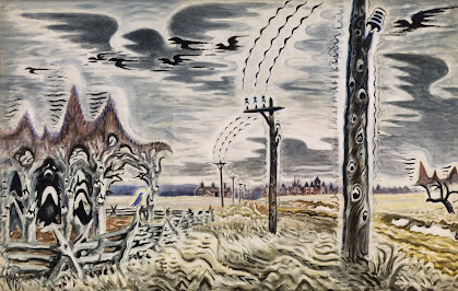
Exploring the Environment: Charles E. Burchfield (1893-1967)

Song of the Telegraph (1952), watercolor on paper, 53" x 34"

    Charles E. Burchfield lived in the Great Lakes region of the US, born in Ohio then moving to Western NY to reside in West Seneca, a suburb of Buffalo, NY.  His body of work presents a keen interest in the immediate environment where he grew up and then lived later in life, employing an approach that is not the traditional western representation and borders on the fantastic in some instances. 

    So, there is a challenge to critics in evaluating Burchfield as Art historians find it difficult to place him into a category: Surrealist?  Superrealist?  Magic Realism?  None of these fit his imagery since there is no direct line evident in any of his drawings or paintings and, as many Art critics or historians will do, they find it easier to pass off Burchfield’s work as “Regionalism” or pronounce that he was a “regional artist.”

    That’s not a bad description necessarily—I’d be happy if any art critic even bothered to say that about me—but this label tends, if not intended by the critics deliberately, to demote the artist as someone who was not following the prevailing or influential styles of their time and bounded out along on their own personal journey that is too idiosyncratic.  Not bringing together the styles current of the artist’s time simply makes it more difficult to comprehend someone who is unique. 

    One may think that those in the Art world would welcome this kind of creativity but instead, and unfortunately, it becomes the albatross around the neck of the artist.  The creative originality is not thought of as intriguingly fresh but as “regional” or “eccentric.”  That’s too bad, since many will take these kinds of criticisms as pertinent to the artist’s work without considering that the imagery provides a fresh perspective.

    Admittedly, in my college days as an art student I wasn’t thrilled by Burchfield’s work.  I thought that some of the paintings and drawings caught the essence of urban and rural landscapes of Western New York (we like to capitalize the “W” so as to make it a distinctive geographic title).  Still, on the whole I was puzzled that he did not try to push a bit more into the other new ways of his era in order to apprehend a subject through the visual art. 

    And that’s exactly what is good about Burchfield, while he did draw upon other streams of depicting the world he made them his own.  Today, I appreciate his vision.  Not only plants and building, but even insects make their way into view; I know that there is more to Art than re-presenting insects, but even those who are more traditional landscape painters rarely give them the spotlight.

    There are still a few drawings and paintings within the Burchfield oeuvre that just do not attract me.  On the whole, however, I see him as an outstanding artist who presented another vision of reality.

Monday, September 5, 2022

Two Arena Art Group Shows!

The Arena Art Group is presenting a couple shows, Body Language at the Nu Movement Cooperative Studio and Gallery (August 8-October 7) and On the Fringe at the Multi-use Community Cultural Center (September 1-October 30).  I have a drawing in each.


Saturday, July 9, 2022

Diptychs, Triptychs, and Comic Books


The Ryerson Diptych, 1275-1285


Daredevil, 1963


What is the rationale behind imagery that is set within boundaries, another dimension of the 2-D space, next to another?  While it’s something that one may take for granted in the West through altarpieces and comic books, since I use this approach to imagery I ask in order to discover an answer or at least some kind of clue.  I enjoy placing one image next to another in different settings to see how the similarities or contrasts sharpen or enhance the other, but maybe there’s more to it than I realize.  So, let’s review those “bounded images” of diptychs, triptychs, and comic book panels.

Altarpieces and devotional art are a part of the western religious heritage, particularly through Christianity.  A good example of this is the 13th century Ryerson diptych, a portable religious artwork, seeing that it can close and move where it is convenient.  Each panel is about 11 x 15 inches, and so when open it is large enough to gain the attention of the devout when in prayer. 

The left side portrays Mary with the child Jesus with angels and the donor, the right side presents the crucifixion with Mary and John the evangelist.  There is much to say about this juxtaposition of two scenes from the life of Christ, from birth to death, but I want to discuss only the use of the diptych for it. 

A first question would be why not portray all this in one piece?  Yes, that can be done, and there are paintings of this and other periods that present multiple actions within one 2-D space whether it is a mural, painting, or icon.  So, is there an advantage to two separate works bound together? 

One advantage would be the ease of portability and storage, and while closed would protect both paintings.  A second reason, though not necessarily an advantage, is that the physical division between the two allows one to concentrate on them separately if desired.  Another point of interest is that the artistic comparison between the two allows the viewer to go back-and-forth to gain meaning from correlation, without having them collide visually.  A final motivation is the narrative view, wherein the order is clear and there is no ambiguity regarding the place or time of each event. 

This last item brings us to the comic book page or as in here, the cover.  Throughout the comic book the panels bring the reader through the story in sequence, it has narrative force.  As the cover here shows, however, it is also a way to provide information and allow the viewer to make the connections among them, whether because of an association or a contrast among the topics.  It assists defining figures and actions in their proper context.

Sometimes one of these reasons or motivations are the aesthetic support for what I’m constructing in an image although at other times I’m not sure, honestly, if there is any particular rationale to it.  So far, it appears to work for my various aims as to what I envision for the final image effect.  And yes, this connection to devotional art and comic book illustration is not by content, usually; instead it is the formal structure and effect that they share.